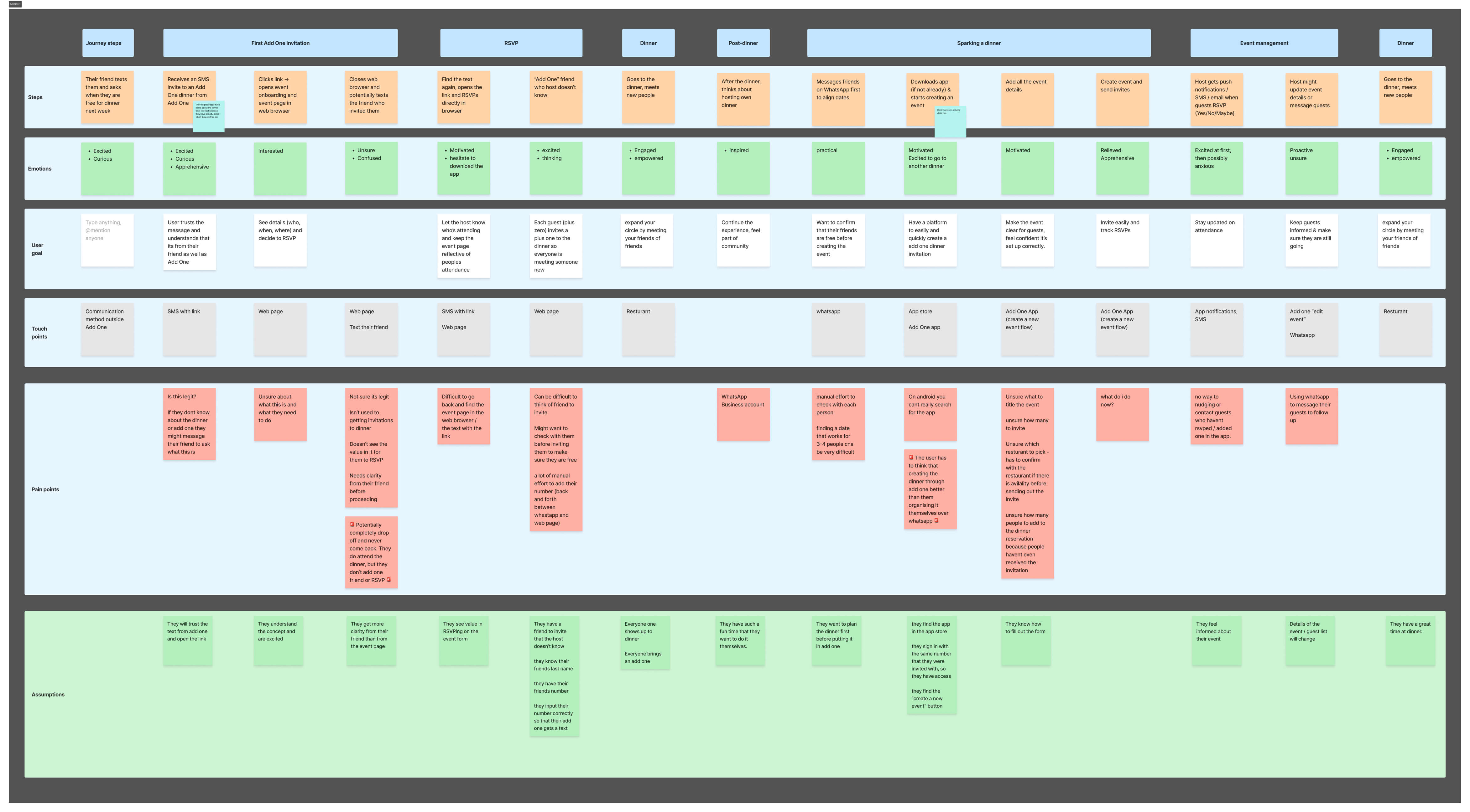
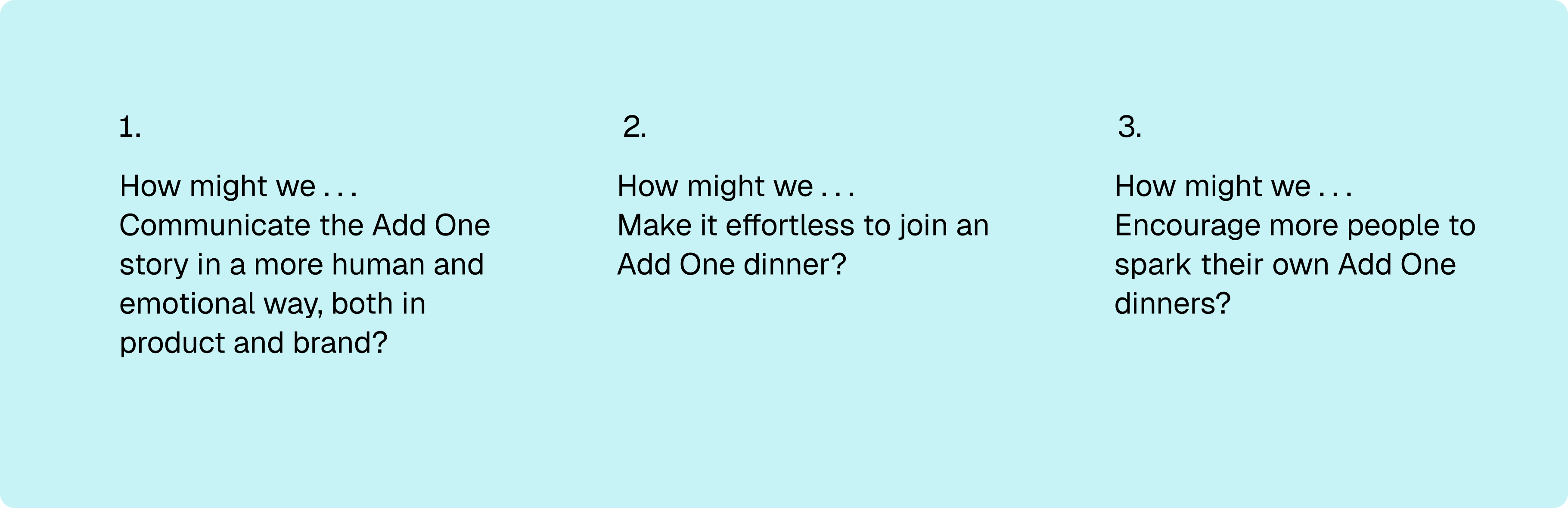
Add One V2
Evolving the Product Experience

Company
Add One
Discipline
Product design | Branding
Introduction
Add One is a new way to meet people, through the people you already know. There are a lot of ways we can meet strangers in today's age. Most of the time, those interactions don’t build strong connections. However, Add One brings together friends of friends.

After launching the MVP and running over 40 Add One dinners, we had validated that people loved the concept of Add One, meeting your friends of friends at dinners, but we also identified key friction points in the product experience.

This phase focused on improving usability, elevating the visual brand, providing clarity, and storytelling.
Discover & Define
After running over 40 dinners using the MVP, we had enough data and feedback to step back and evaluate how people were actually using (or not using) Add One. Through user interviews, journey mapping, and analysing in-app behaviour, there were many key learnings.
User jounrey map | The full Add One product cycle – invited to dinner, RSVP, attend the dinner and host their own.
Problem definition
From this research, we defined three design challenges:
Phrasing our design challenges in HMW statements
Rebranding the Product
As we prepared to evolve Add One beyond the MVP, it became clear that our product and brand were telling two different stories. The product felt functional and tech-driven. But the brand was about something much more emotional: the joy of meeting new people through the people you already know.

We needed to align the visual identity and in-app experience with the purpose.
User flow map | User being invited to an Add One event, RSVP, attending dinner and then organise their own dinner
Key product improvements
Clear Onboarding FlowIntroduced a simple welcome flow that clearly explained what Add One is and what users are expected to do. This gave guests immediate context before seeing an event page.
Clear onboarding flow once users open their invitation
Simplified Event Page
Removed unnecessary elements, improved hierarchy, and focused attention on who’s attending, what’s happening, and what to do next.
Add One event page
Connected Guest Pairs
Redesigned the guest list to visually link each guest and their “add one.” Each had a clear CTA next to their name, “RSVP” and “Invite”.
User flow map | User being invited to an Add One event, RSVP, attending dinner and then organise their own dinner
Reimagined Event Creation Flow
Added onboarding guidance for sparks and simplified creation form to mirror the new guest experience.

Add the functionality to be able to co-spark a dinner with a friend reduce the feeling of hosting pressure.
Add One event page
What we learned
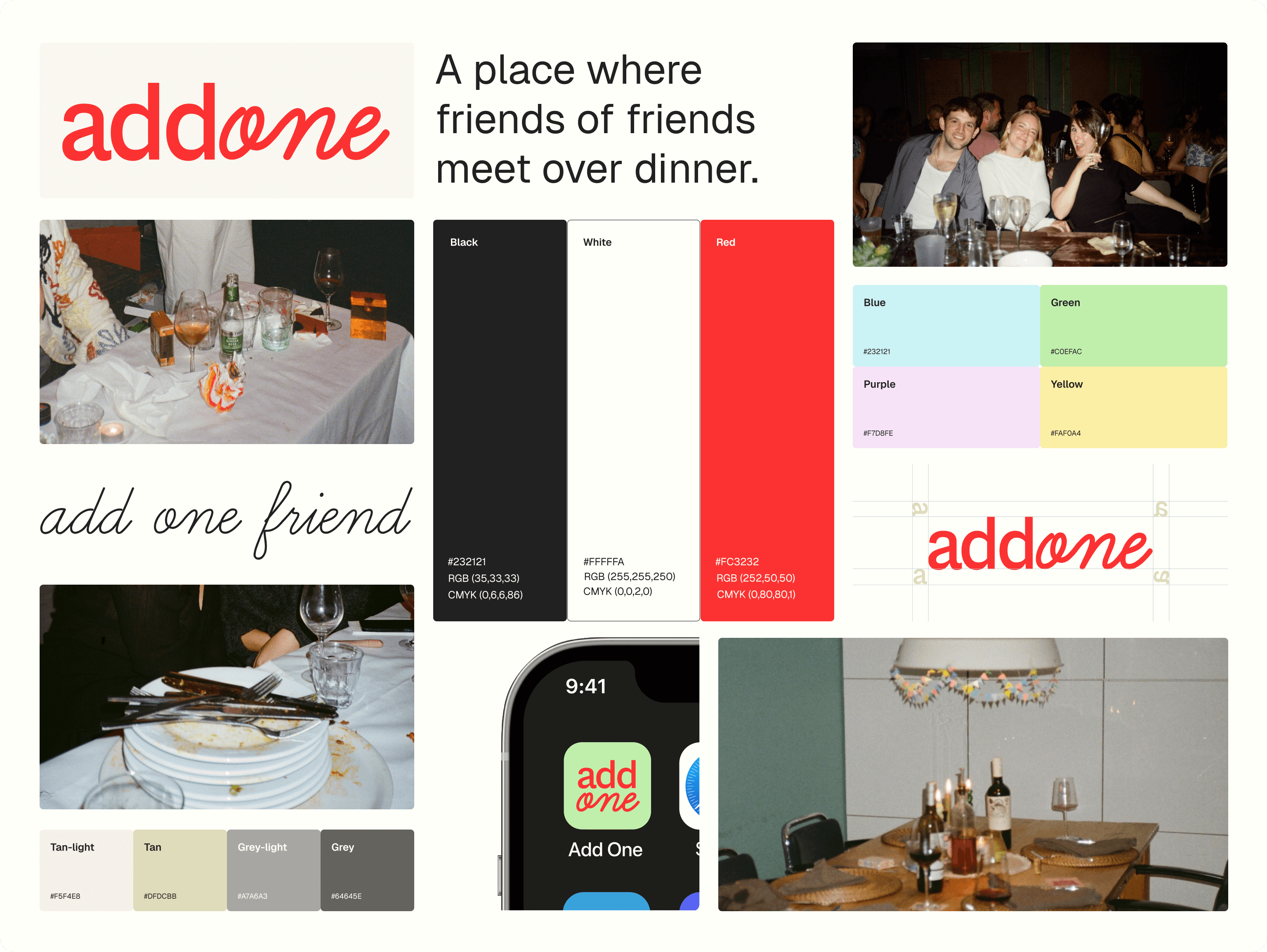
After releasing the redesigned experience and rebrand, the product was more cohesive, the flows were smoother, and the brand finally reflected our mission. However, when we looked closer, new insights emerged:

Building the app was slow and expensive.
Iterating on the MVP required too much time and effort, it was a slow way of testing ideas.

There were still too many usability issues to confidently promote the app at scale.

User behaviour didn’t match their feedback.

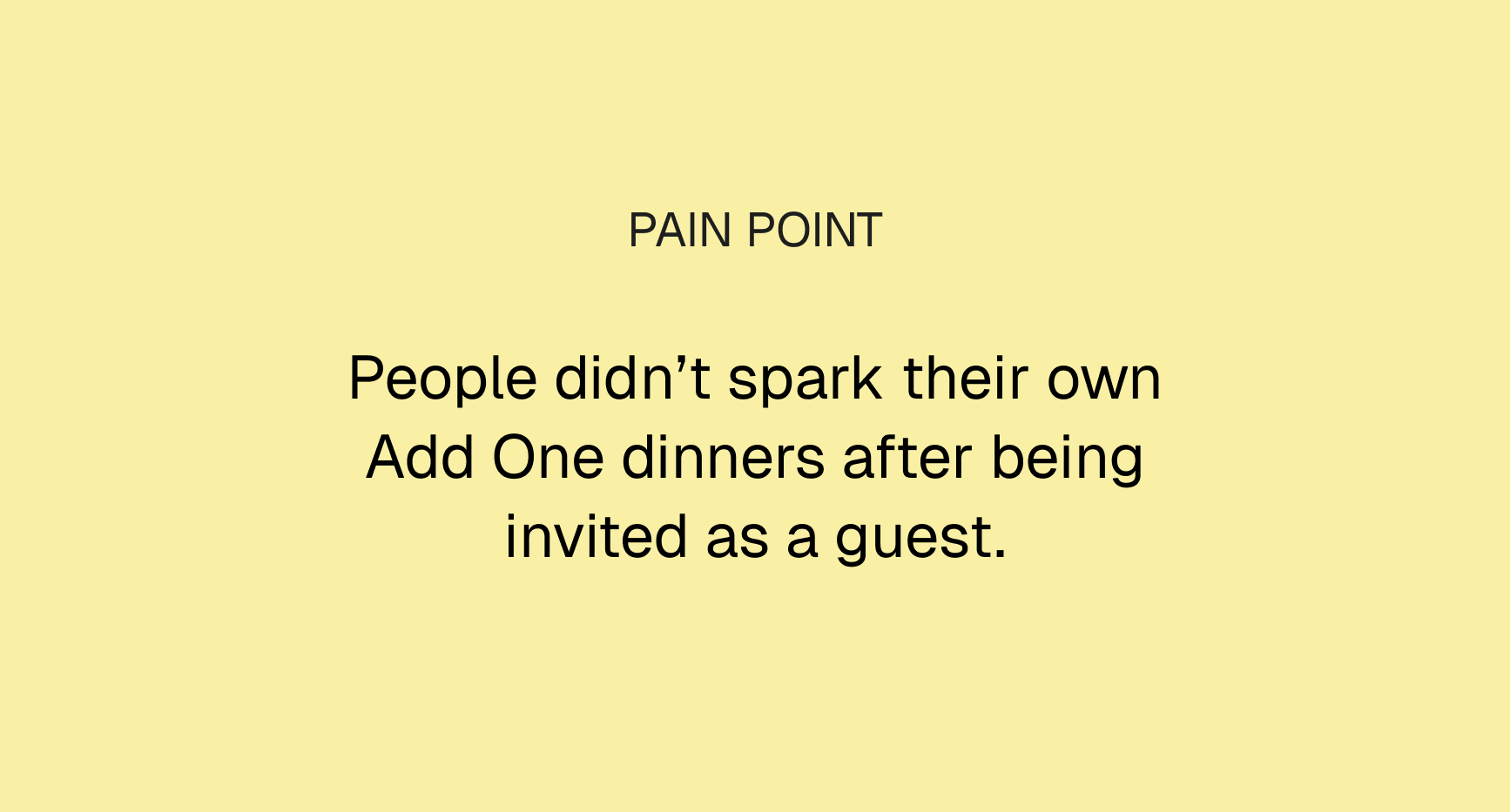
People said they loved the idea of Add One, but in reality, very few people actually sparked their own Add One dinners.

These learnings led to an important shift: Instead of continuing to invest in the app, we decided to pivot toward in-person experiments, bringing people together through real dinners, without the constraints of the app.
Next project
Learner Onboarding