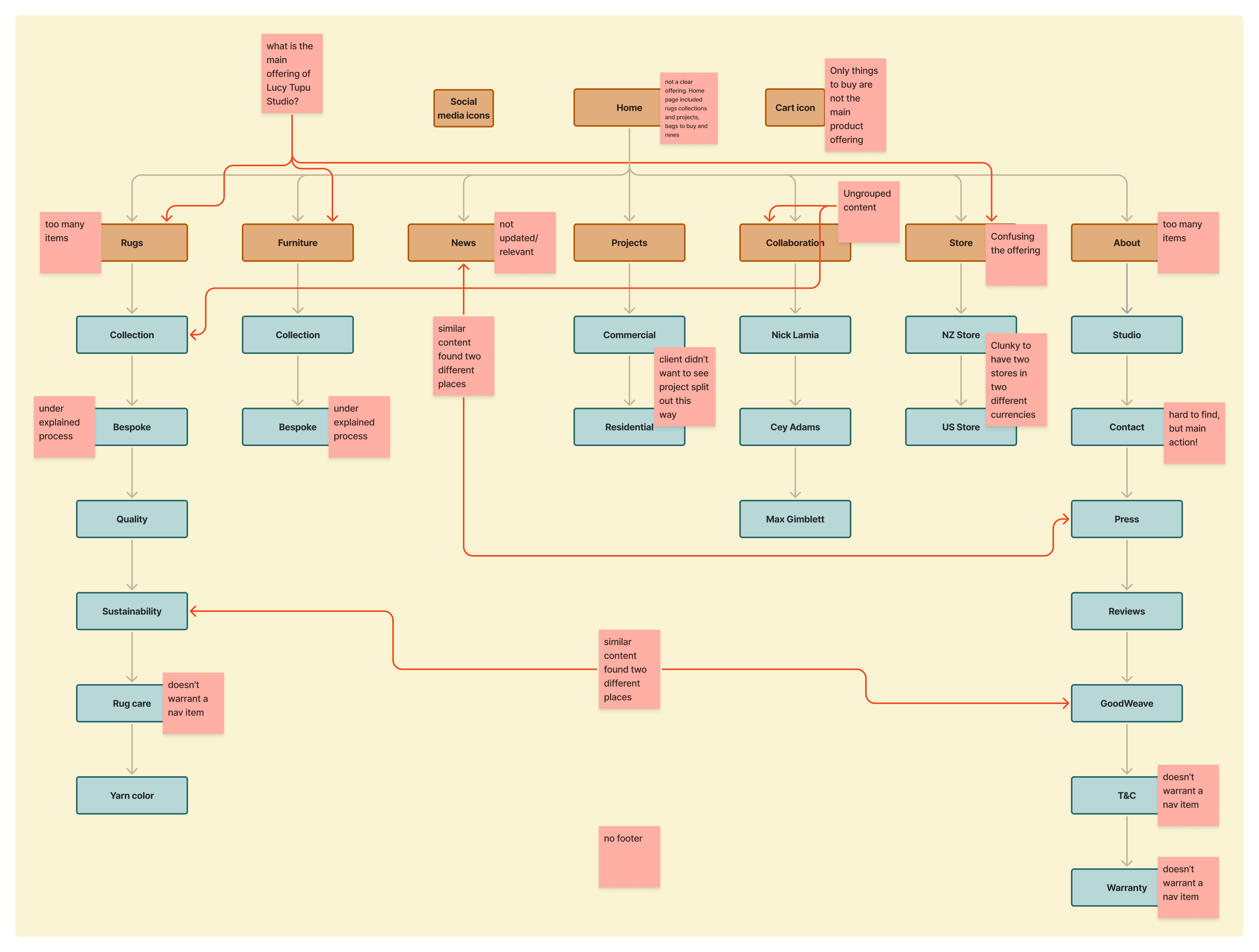
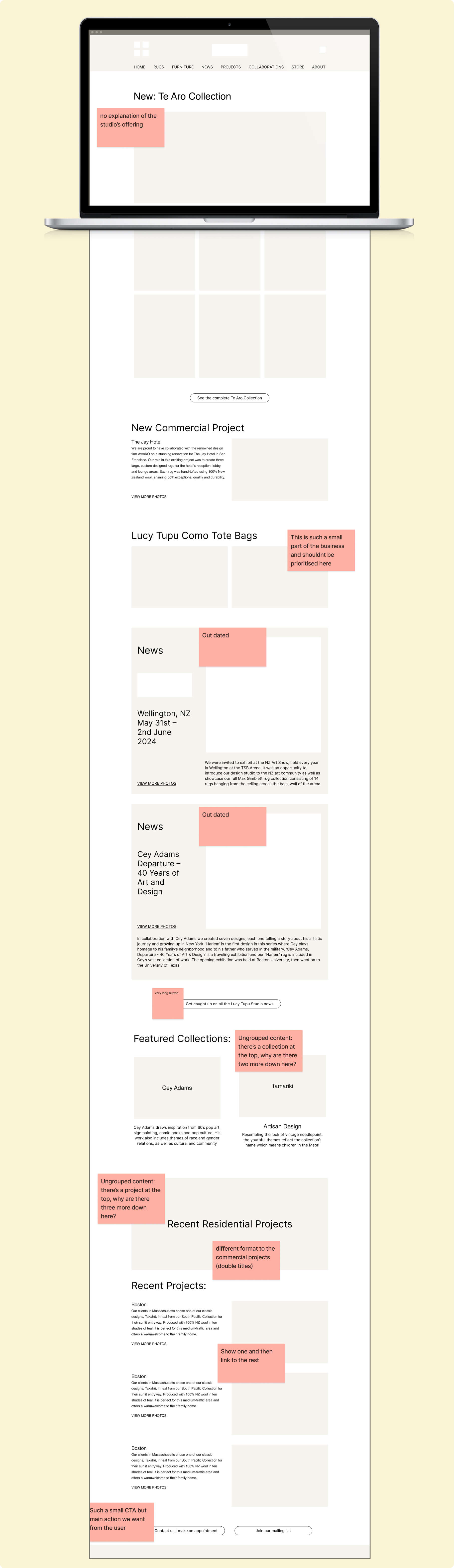
Lucy Tupu Studio

Company
Lucy Tupu Studio
Discipline
Information Architecture
Introduction
Lucy Tupu Studio is a New York–based design studio specialising in rugs. The old website made it difficult for visitors to understand what Lucy Tupu Studio actually offered. There were too many disparate elements all mixed together without a clear hierarchy.

My role was to lead the information architecture and UX/UI redesign of the site. I audited existing content, mapped a new sitemap, and designed key page templates to better showcase products and projects. I collaborated closely with Lucy and her team to align the online experience with the studio’s identity.
The goal
Highlights rugs as the studio’s main offering
Brings to life the two distinct processes for working with the studio
Consolidates and organises content
Original site structure
Old home page wireframe
The problem
The old website made it difficult for visitors to understand what Lucy Tupu Studio actually offered.

There were too many disparate elements all mixed together without a clear hierarchy.

Key differentiators like the studio’s two distinct processes for working with clients were barely visible and under-explained.
New site structure
New home page wireframe
Improvements
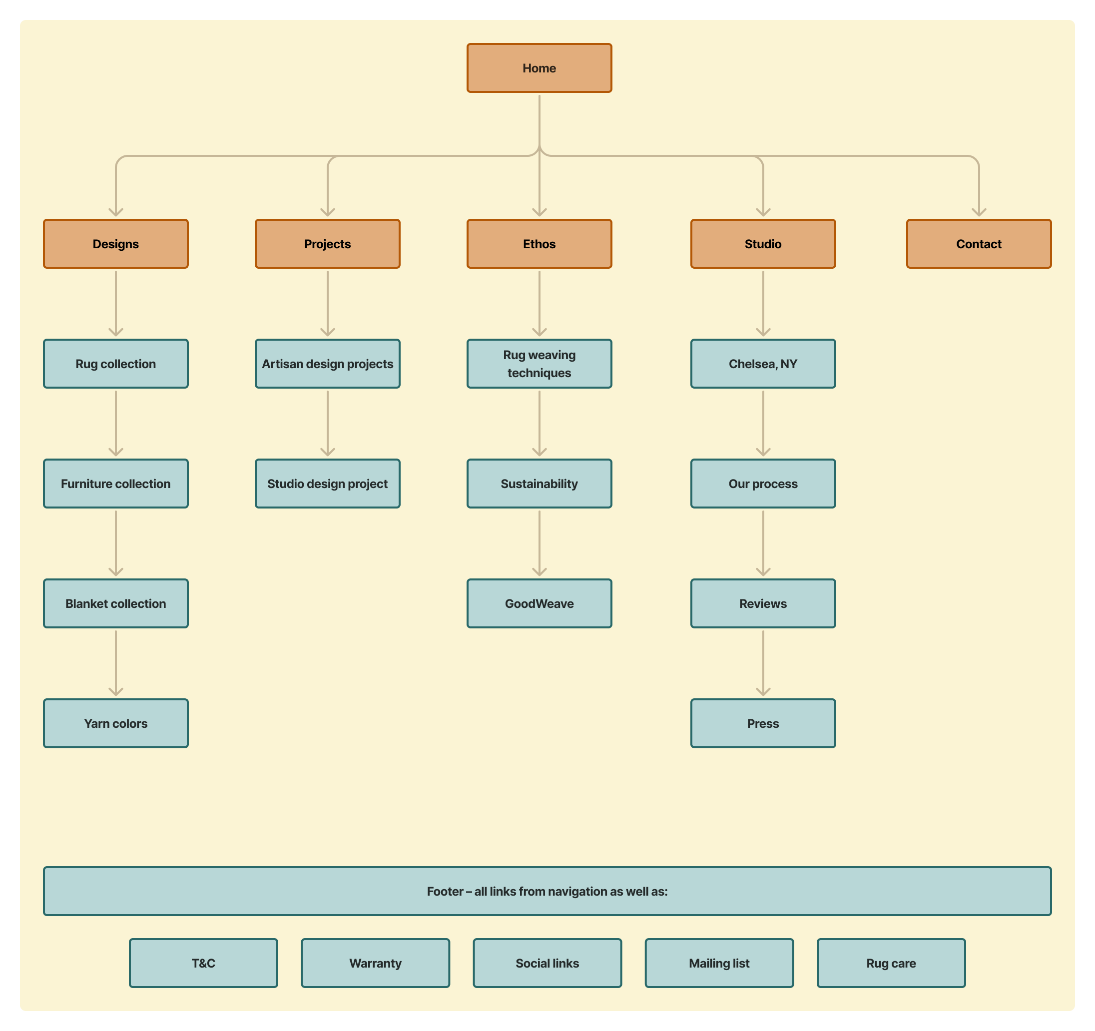
The redesigned information architecture and home page reshaped how the studio presents itself. The new site now:

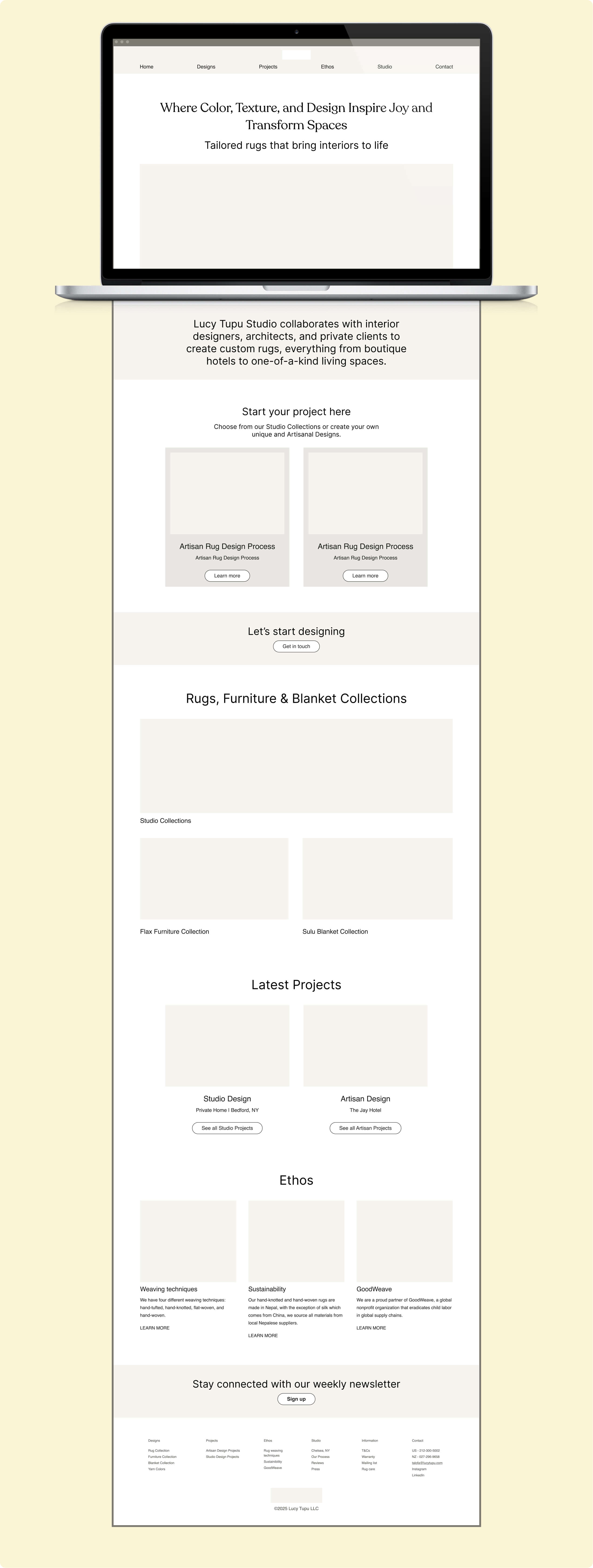
Clearly explains what Lucy Tupu Studio does and who they work with.

Introduces and gives prominence to the two distinct processes for working with the studio, highlighting them on the homepage.

Establishes clear hierarchy between offerings by prioritising rugs as the primary focus while still showcasing furniture and blanket collections.

Reorganises and consolidates content, reducing top-level navigation items, and adding a footer for secondary links.

Surfaces contact information and calls-to-action at the top level.
Next project
Scoff